Let’s be honest: we all judge a portfolio by its cover.
Whether it’s for a university application, a job interview, or a new client pitch, your portfolio cover sets the tone for everything that follows.
Think of it as the front door to your design story.
And just like any good entrance — it should invite people in.
If you’re stuck on where to begin, here’s a quick-start guide to architecture portfolio cover design, from current trends to practical tools.
Why Your Cover Matters
You’ve put hours (okay, days) into your layout, project curation, and visuals. Don’t let your cover be an afterthought.
Your cover is the first impression, and it communicates a lot — even before someone opens the first page.
A good cover should:
-
Set the tone for the entire portfolio
-
Reflect your design personality (or your firm’s brand)
-
Convey clarity, control, and confidence
-
Make someone want to keep reading
Trends in Architecture Portfolio Cover Design
If you’re looking for inspiration, here are some trends we’re seeing (and loving):
1. Minimalism with Intent
Less really is more — especially when combined with strong structure. Think clean typography, one dominant color, and lots of breathing space.
2. Full-Bleed Statement Image
A single project render or model photo that sets the visual tone for the portfolio. Works especially well if your style leans photorealistic or conceptual.
3. Muted, Earthy Color Palettes
Softer neutrals and materials-inspired colors (stone, concrete, graphite) create a calm, timeless look that feels both natural and curated.
4. Asymmetry
Off-center layouts, cropped text, and playful alignment are increasingly popular — especially for portfolios aimed at creative firms or competitions.
5. Texture + Typography
Subtle grain, overlays, or architectural materials (concrete textures, line work) paired with elegant type give depth and context to your design voice.
Typography & Visual Hierarchy
Your cover might only have a few words, but they still need to be designed well. Here’s how to get the most out of your type choices:
Choose A Font You Trust
It's often best to stick to one clean, modern typeface that reflects your design voice and lets your work speak for itself. Popular choices like Helvetica, Futura, or Avenir are reliable and timeless. Avoid overly decorative fonts — they might look interesting at first glance, but they often sacrifice clarity and professionalism.
Use font weights (like bold, medium, and light) to establish clear hierarchy without switching typefaces. That way, you're organizing your text so that the reader knows what’s most important at a glance.
Define Your Hierarchy
Usually:
-
Your Name
-
“Architecture Portfolio” or similar label
-
Optional: date, school, firm, location, or project title
Keep everything in proportion — and use contrast (weight, size, spacing) to show what matters most.
Use Alignment Intentionally
Left-aligned is safe and readable. Centered can feel formal or elegant. Off-center can feel bold and modern. Whatever you pick, keep it consistent with your layout.
Tools & Templates to Build Your Cover
You don’t need to reinvent the wheel. Here are some tools and templates to get started:
Adobe InDesign
Still the go-to for most architecture students and professionals. Use master pages, grid systems, and paragraph styles for clean, modular design.
Canva
Great for quick mockups or casual portfolios. Use their pre-built templates and swap in your content. Just be mindful of creative limitations — less control than pro tools.
Figma
Originally for UI design, but more architects are using it for portfolios. Live collaboration and cloud syncing are a bonus.
Templates & Inspiration
-
Pinterest (search: architecture portfolio cover)
-
Issuu & Behance (browse published portfolios)
-
Etsy & Creative Market (buy customizable portfolio templates)
Tip: Use templates as a starting point, not a crutch. Customize to match your voice and content.
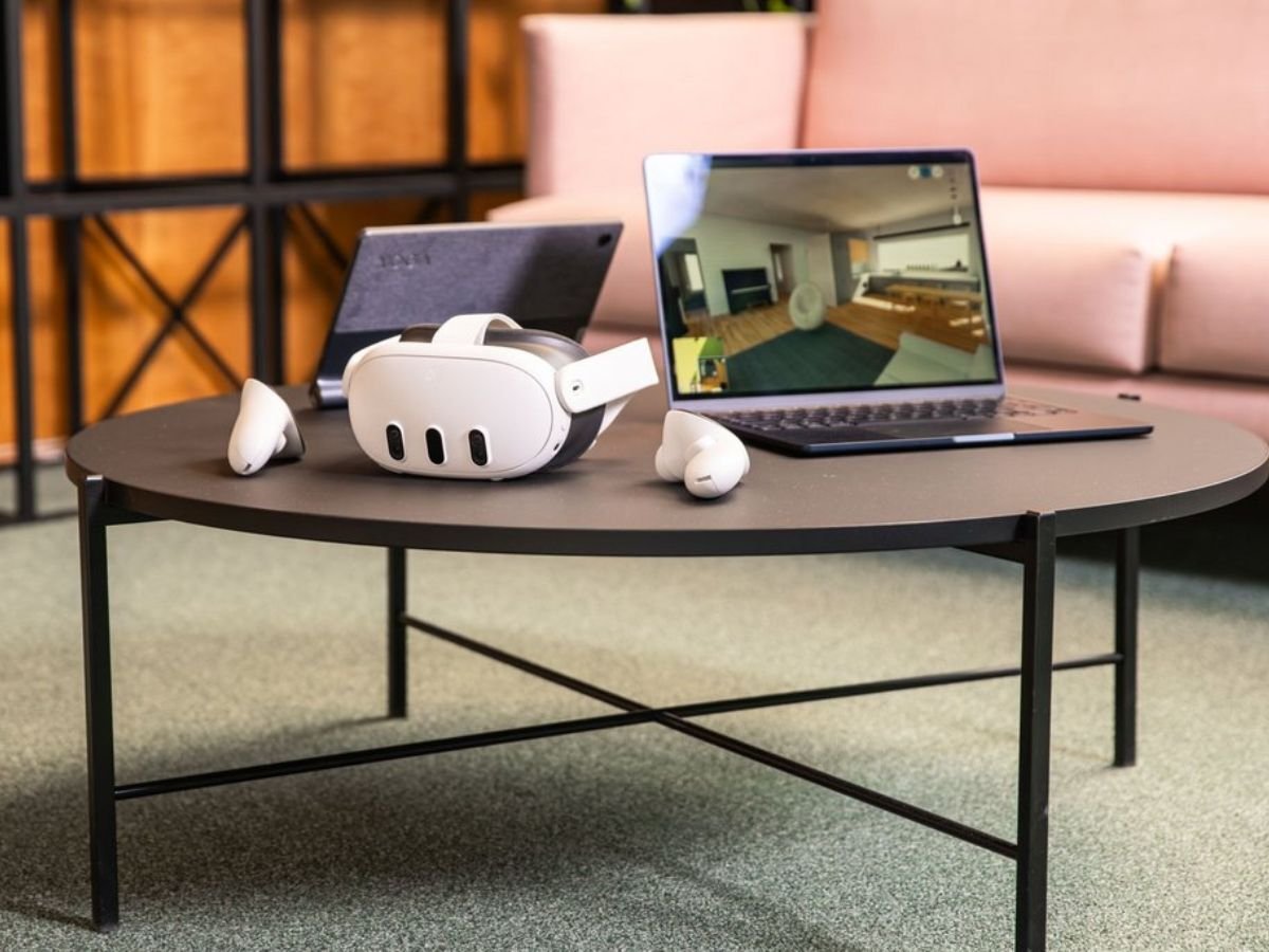
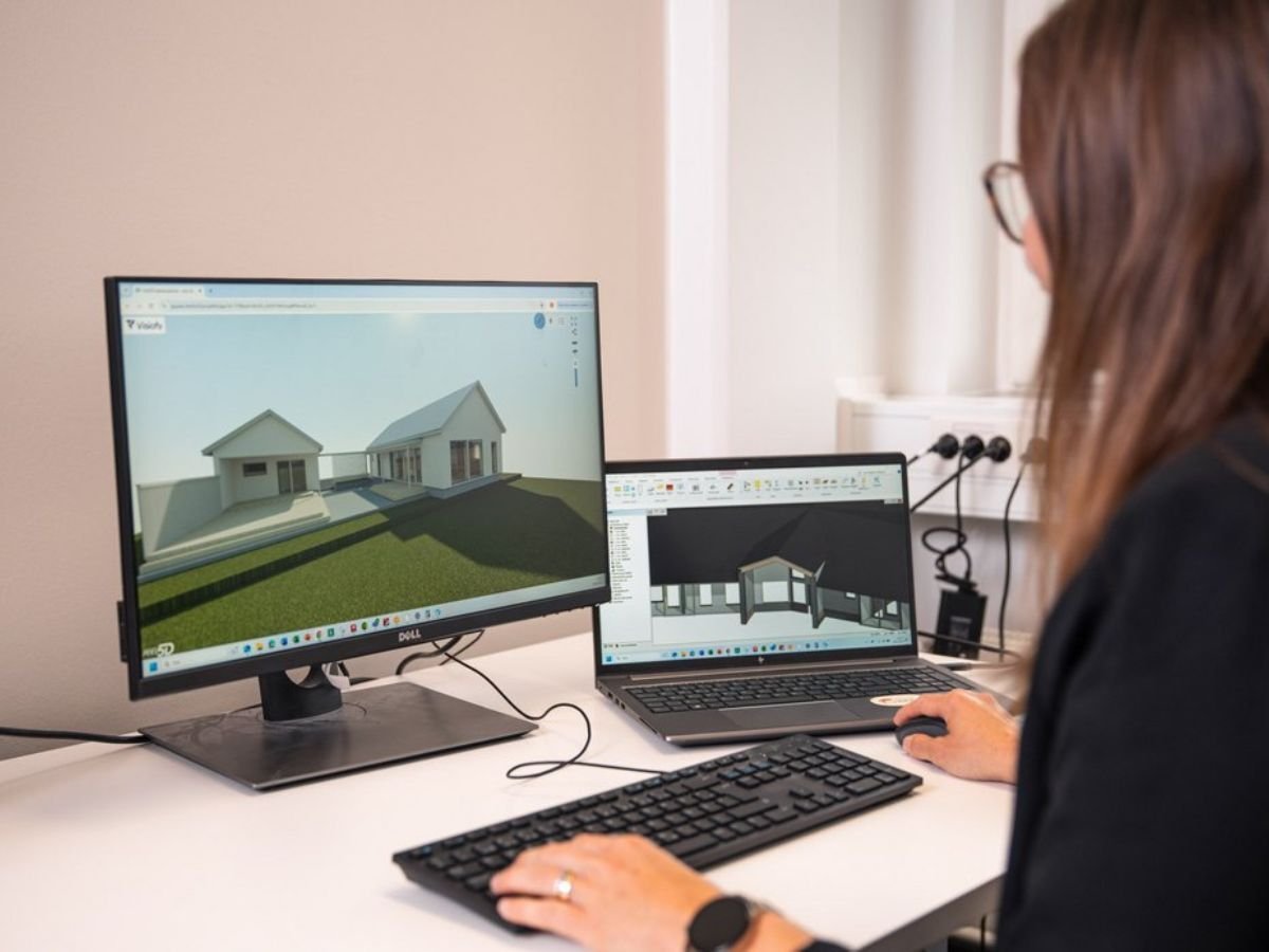
💡 Bonus tip: Want to Go Beyond the Cover?
While your cover makes the first impression, what’s inside is where you can really surprise people. Consider adding a link to a walkable model of one of your projects. A virtual walkthrough not only shows your spatial thinking — it proves you’re keeping ahead of today’s tech.
If you'd like to give this a try, Visiofy's free tier allows you to upload three 3D designs and convert them into a virtual walkthrough. Just sign up, hit "New project" and the rest is a walk in the park!
Related Reading
The Ultimate Guide to Creating a Stunning Architecture Portfolio